


This article may reference legacy company names: Continental Mapping, GISinc, or TSG Solutions. These three companies merged in January 2021 to form a new geospatial leader [Axim Geospatial].
In the wake of the current COVID-19 (Coronavirus) pandemic, leaders and citizens across the globe want visualization and regular updates on the current spread, trends, and advisories. In the past, leaders have reported on progress and trends using static PowerPoint presentations. Now, using Esri’s Operations Dashboard for ArcGIS allows them to leverage data streams to dynamically update their view and enable real-time decision making.
Custom Operations Dashboard Potential
You may have seen the trending map created at Johns Hopkins University: COVID-19 Dashboard. Johns Hopkins also leveraged Esri’s Operation Dashboard to create this interactive web map.
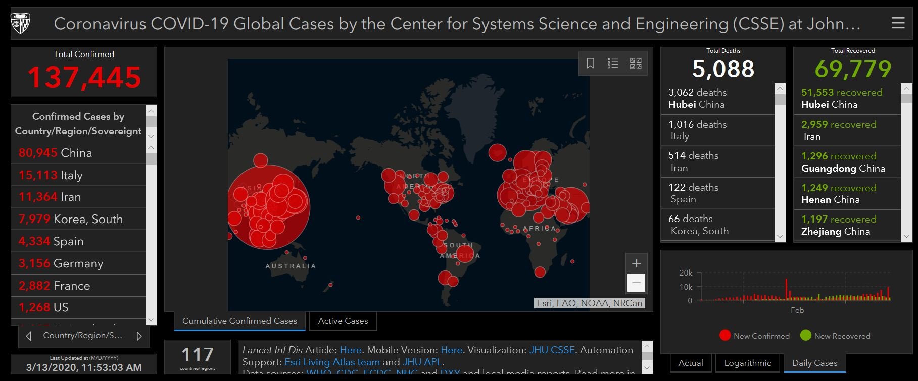
While this map alone is providing insight across the country – check social media, it’s gone viral!—the platform allows you to create a truly customized “one stop shop” to answer the metrics that are meaningful to you and your organization.
The purpose of Esri Operations Dashboards is to make decisions at a glance. As long as the data is available, GISinc can help you customize dashboards to meet your needs.
Example data sets you may consider mapping, using the Coronavirus as an example:
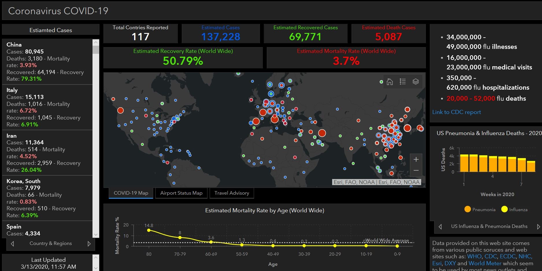
- Estimated Cases
- Total Confirmed Cases
- Confirmed Cases by Country
- Estimated Mortality Rates by Age
- Estimated Recovery Cases
- Total Confirmed Recovery Cases
- Estimated Death Cases
- Total Confirmed Deaths
- Estimated Recovery Rate Worldwide
- Estimated Mortality Rate Worldwide
- Any data set available specific to your organization!
Here’s an example of another COVID-19 Dashboard a GISinc employee customized so he could see metrics (that Johns Hopkins excluded) such as recovery rate, mortality rate, mortality rate by age, and comparable statistics for the Flu.
Recent success story of leveraging Esri’s ArcGIS Platform for COVID-19 Tracking
The Problem: Visualization of COVID-19 Metrics Important to Customer
Recently, a Crisis Battle Staff (CBS) at a customer of ours requested a PowerPoint to use to communicate metrics for each briefing between staff turnovers.
The Solution: StoryMaps of Operations Dashboards
My GISinc colleague overachieved, per usual. She and a team leveraged Esri’s Operations Dashboard for ArcGIS to display the exact criteria our customer wanted to track.
Since there were several dashboards generated to cover the full scope of the customer’s request, GISinc created a Portal Instance—without the need for customer infrastructure—in which all dashboards and ancillary data were compiled into one Esri StoryMap within a few hours. The final product was emailed out and reported to high level management.
Results
After receiving exemplary feedback, the StoryMap is now used as an everyday briefing. Within less than an hour there were over 100 views to the StoryMap, even with the requirement of having a Common Access Card (CAC) to access it. Now that they are using the dashboards to make decisions at a glance, further customizations and additional data sets can be added to allow leaders to monitor the data that maters most.
PSA: Warning of SPAM in Public Maps
Unfortunately, there are some cruel people in this world who are taking advantage of a terrible pandemic. Worse than the ones currently hoarding toilet paper—BTW I will totally trade you 1 Sam’s jumbo pack of paper towels for 4 modest rolls of toilet paper—there have been cases of malicious attacks against specific dashboards.
Please be aware that cybercriminals regularly leverage news items, but are now known to have disseminated real-time, accurate information about global infection rates regarding COVID-19 (See news here). Please note if you are visiting and viewing a dashboard that is public, it should never request a payment or require you to download anything. Do not provide your email address, credit card information, or download any files, as those requirements are often linked to cybercrimes.
Esri ArcGIS users that create the dashboards themselves will need to login using their ArcGIS Online account.